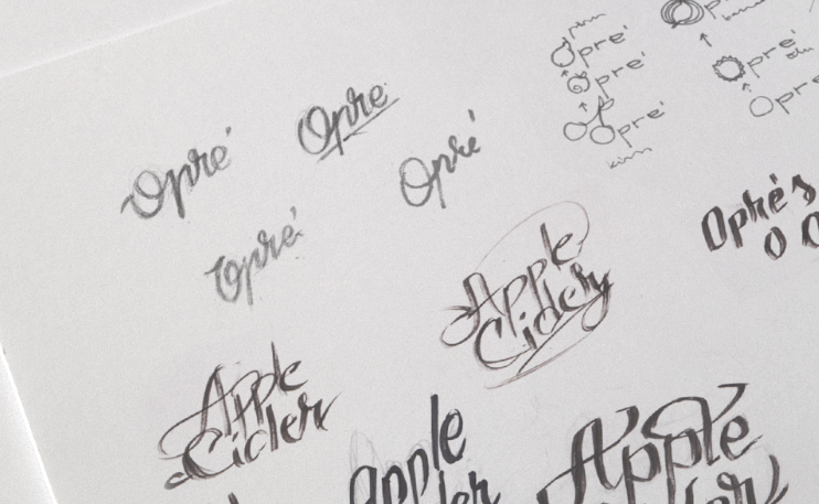
First impression are important. Always, everywhere. It’s not the most important factor, but often,the decisions you make, especially when choosing something new, are based on the firstimpression. Armed with this knowledge and enthusiasm to create something a little different, we bang making the labels for our lemonades. We had a great foundation to build on in the field of label making and acquiring bottles from the time spent designing products at our sister company, Opre’ Cider.
After a successful cooperation for Opre’ Cider, we went back to our friend Kärt, now with a unique project. Since our lemonades are different than the rest of the competition, we needed to tell the same story on the labels themselves. We managed to do just that through impressionism inspired paintings which capture the foundation of our herbal alchemy, natural features and organic ingredients.
Maybe we should have left it at that, but we wanted to attract one more sense of our customers. Meaning, we used special paper for the labels. Since the paintings themselves are… well, paintings, why not bring this fact to the hands of people? Our labels have texture which resembles painted canvas, closing the circle of joy, which every single bottle of mellos brings - delicious taste, pleasant smell and a picturesque label printed on unusual paper.
Painting for thyme & mint label
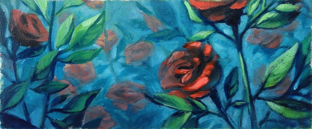
Painting for rose & hibiscus label
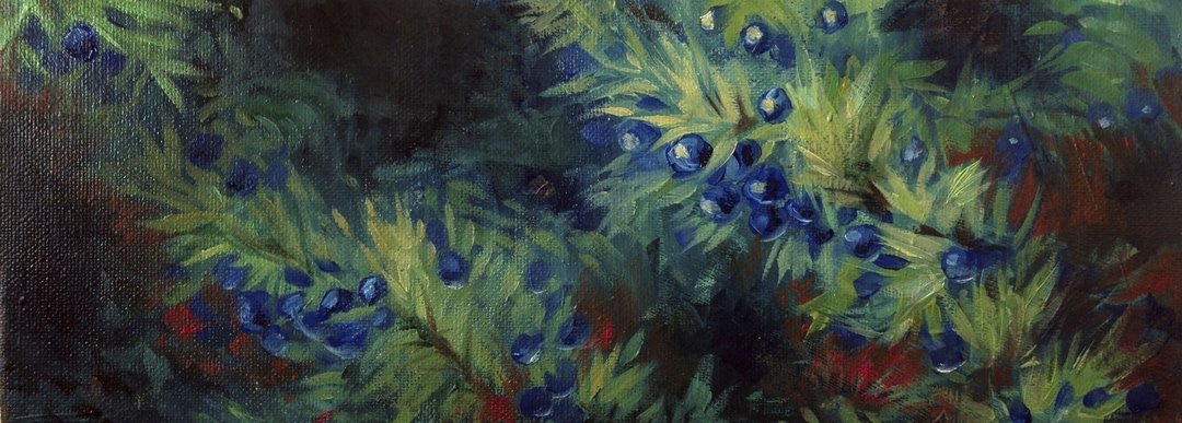
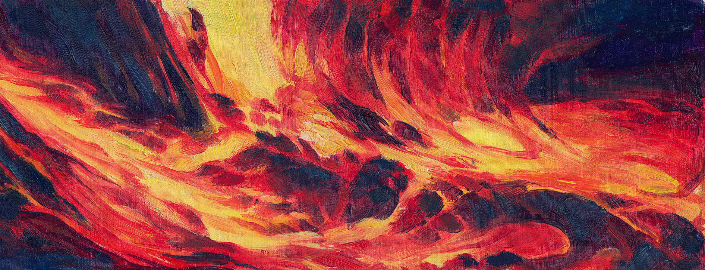
Painting for juniper & chilli label
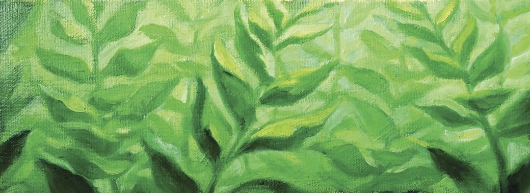
Painting for natural energy label
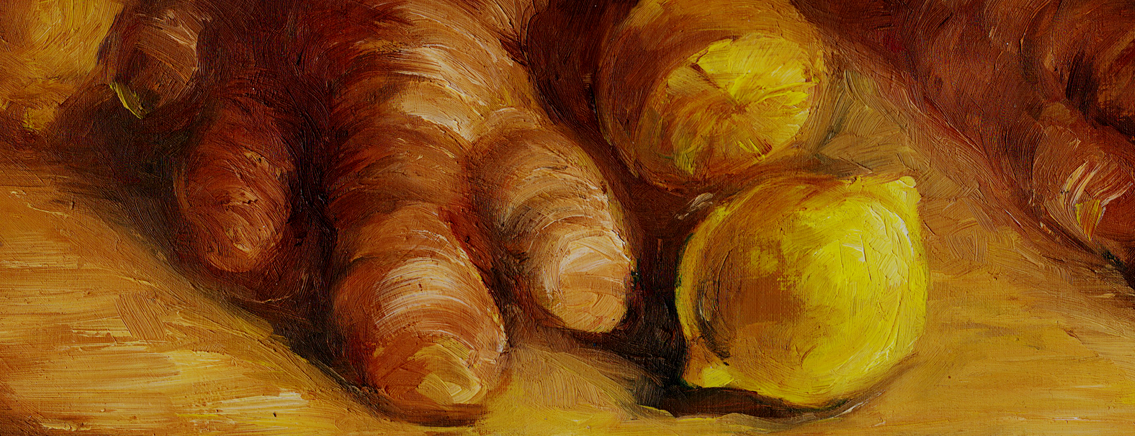
Painting for ginger & lemon label